Lesson 9 · 9 min
Editing: The Right Order
Fix brightness first, then color, crop last, and always compare with the original before you export.
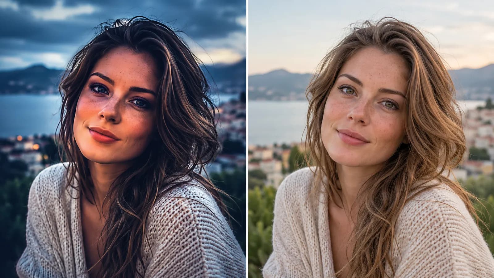
In this lesson: the order to edit a photo in, and why the order matters. Why it matters on an HNC shoot: HNC's promise is edited photos before the client leaves, so you will edit quickly, on site, with the client waiting. A short, repeatable order makes your edits fast and keeps them natural, and it stops you from fixing one thing and breaking another.
Why order matters
Every edit changes how the next one looks. If you boost the color first and then brighten the photo, the colors shift again and you start over. If you crop first and then change your mind, the pixels are gone. Working in the same order every time means each step builds on the last, and you only do each one once.
Step 1: Brightness first
A photo that is too dark or too bright will never look right, however nice the colors are. So start here. Use your editor's brightness or exposure slider until the face looks right: clear, bright and natural, with detail in the eyes. Then adjust the highlights (the brightest parts, so the sky or a white dress does not lose detail) and the shadows (the dark parts, to open up dark eyes or a dark jacket).
Do not judge the brightness by the whole picture. Judge it by the face, since that is what the client will look at.
Move the slider until the face looks natural, and stop. A common beginner mistake is to push it too far, so the skin loses detail and looks flat and white. If the brightest areas turn to pure white, you have gone too far.
Step 2: Then color
Once the brightness is right, fix the color:
- White balance (warmth). If the photo looks too yellow or too blue, adjust the temperature slider until white things look white and skin looks like skin.
- A little vibrance or saturation, if the picture needs it. Go gently: a small move is enough.
Why skin tones break when you over-saturate
Skin is made of subtle, narrow shades of orange and pink. When you turn up the saturation too far, those shades are pushed to the extreme: faces turn orange or red, and the picture looks fake. Everything else in the picture can still look fine, which is why the problem is easy to miss. Two ways to avoid it:
- Use vibrance rather than saturation if your editor has both. Vibrance boosts dull colors and leaves skin alone.
- Check the skin against something known. Compare the face with the person's neck, hands and the whites of their eyes. If the face is a different color from the rest of the person, you have gone too far.
Leave skin texture alone. Heavy smoothing makes people look like plastic, and clients can tell.
Step 3: Crop last
Crop at the very end. Until then you want all the pixels, because a different crop might be needed (a square for a post, a tall version for a story). Cropping early throws away the choices you might want later, and the tools judge the brightness and color across the whole frame.
When you do crop:
- Straighten first if the horizon is tilted.
- Follow the rule of thirds (lesson 5): eyes on the top third, space in front of them.
- Cut between joints, not at wrists or ankles.
- Remove distractions at the edges, such as a stranger or a bright patch.
- Do not crop so hard that the photo looks pixelated. If you have to crop far into the picture, the original was too far away.
Step 4: Compare with the original
Before you export, look at the original and the edit, side by side. Most editors let you press and hold the picture, or tap a "compare" or "original" button, to flip between them. Ask:
- Does the edit look better than the original, or just different?
- Do the skin tones still look natural?
- Did I lose detail in the highlights (a white dress) or the shadows (a dark suit)?
- Would the client say "that looks like me, on a good day"?
If the answer to the last question is yes, stop. If you cannot decide whether an edit helped, undo it. Natural beats dramatic every time.
Step 5: Export
Export the finished photo at full quality, and give the files clear order or names if you can. HNC does not resize or compress anything you upload, so what you export is exactly what the client receives. Check the exported copy, not just the edit on screen, before you upload.
Common mistakes and how to avoid them
- Editing color before brightness. Brightness first, then color.
- Over-saturating. Faces turn orange. Use vibrance, and compare skin with the neck and hands.
- Cropping first. Crop last, after the other edits are finished.
- Heavy skin smoothing. Keep skin looking like skin.
- Applying one strong preset to every photo. Check each photo, because each one has different light.
- Never comparing with the original. Always flip back and forth before exporting.
- Spending ten minutes on one photo. On site, aim for one to two minutes per photo, and move on.
Key takeaway
Brightness, then color, then crop last, and always compare with the original before you export.
Want to save your progress? Sign up as a photographer.